Building an Agentic Design System in Under 3 Days
Steelbook is a React design system I built from my own Figma file in 59 hours, with a coding agent writing the code and me writing the rules. I wanted to know how much of a real component library an agent can build in a long weekend if the design file is the specification and the build enforces every rule.
It came out at 50 components, 34 icons and 329 design tokens. Every one of them traces back to the Figma file, and the build fails if one stops matching it.

Key figures
59
Hours from first commit to a 50-component library
50
Components built from Figma through to GitHub
No
Drift- Figma
- Storybook
- Design docs
- Code components
Overview
Project overview
Steelbook is a personal project: a React component library built from a Figma file I designed, with a coding agent doing the implementation. Each component in the file carries a written description of how it should be built, and the agent works from that description.
I wanted to answer two questions. How fast can an agent build a design system when the design is fully specified? And once it can, which parts of design leadership still need a person?
Problem
Coding agents are fast, but left on their own they make things up. Ask one for a button twice and you get two buttons, each with its own hex values and its own idea of what "medium" means. Both pass review, because nothing in the request said what the answer should be.
- Invented values: Colors and sizes that look right but don't come from the design.
- Duplicate components: A second version of something that already exists, which is the easiest mistake for an agent to make and the hardest to notice once it's in.
- Drift: Props and behavior that move a little further from the design with every change.
Goals
- Build a working component library from the Figma file in one long weekend.
- Take every value from a design token, with no hardcoded colors, sizes or fonts.
- Keep each component's props matched to its Figma description, and fail the build when they drift.
- Keep every design decision with me: where the file is silent, the agent stops and asks.
Constraints
Scope and constraints
Nothing uses this library yet. There's no product and no team to win over, so it's a rehearsal: the cheapest place to find out where this way of working breaks.
Technical
Figma's API can't read font family, weight or Archivo's width axis, so type rules had to live in written text style descriptions.
Team
One person and one agent. With nobody else reviewing, anything I didn't write down didn't get checked.
Time
Under three days. Every change had to be small enough for me to review it myself.
Tooling
Code Connect isn't on this Figma plan, and the 768px breakpoint has no variable behind it, so a few links between Figma and code were made by hand.
Process
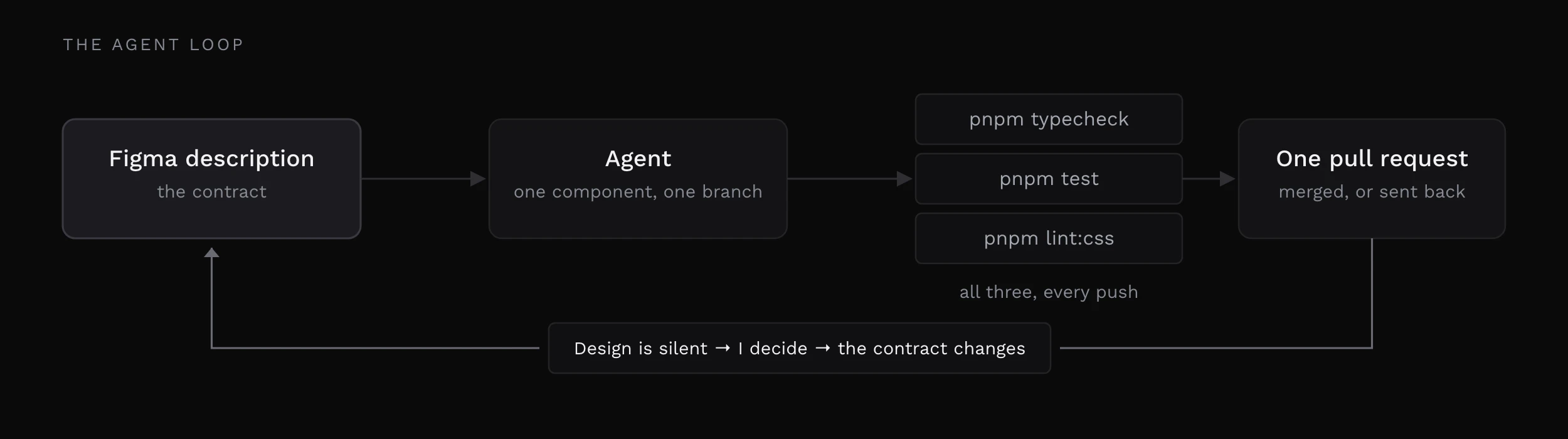
One component was one unit of work, and one pull request was one unit of review. For each component the agent read its Figma description, built it on Ark UI, wrote its Storybook stories and a type test, and opened a pull request. Three checks ran on every one: pnpm typecheck, pnpm test and pnpm lint:css. Then I reviewed the change against the description I had written.
Keeping each pull request small is where the speed came from.
The cadence
53
Pull requests
10
Minutes between components, median
102
Commits, one author
Decisions
Key decisions
Four rules did most of the work. At the speed the agent works, my attention is the bottleneck, so every rule is enforced by something that can fail a build.
Decision 01
Every value from a token
No hex codes, raw pixels or font declarations in component CSS
A custom Stylelint configuration treats a raw value as a build error, and allows
calc()only when every term in it is a token.Trade-off
When the design uses a value with no token, work stops until I decide. Snapping to the nearest value would be faster, and it's how a system ends up with a second spacing scale.
Decision 02
States live in CSS
Hover, active, focus and disabled come from the browser
Figma draws those states as variants because it has no other way to show them. Copying that into code would give every component a
stateprop, and make every team using it manage something the browser already knows.Trade-off
Every component carries a type test that fails if a
stateprop appears. That's fifty small tests against one mistake that would spread everywhere.
Decision 03
Silence means stop
When the design doesn't say, the agent asks
If the file doesn't answer a question, the agent flags the gap and waits for me instead of filling it in.
Trade-off
It's the slowest rule in the set, and the one that keeps the design decisions with the designer.
Decision 04
Reuse, never regenerate
Import what exists, and extend what's close
If a component exists, the agent imports it. If something close exists, it extends it. A second version of an existing component counts as a defect.
Trade-off
More checking on my side, because duplicates are what an agent produces most naturally.
Solution
Steelbook is a package of React components, a generated token layer and a Storybook that draws every component at the size of its Figma frame, so the two can be measured against each other.
The description is the contract
An agent can read a frame's padding and colors on its own. What it can't read is intent, so every component in the Figma file carries a written description: which primitive to build on, how each Figma property maps to a prop, and what the defaults are. The code is checked against that description, and when a description changes, the next update re-reads it and compares it with what exists.
Tokens
The 329 tokens are generated from four Figma variable collections: Primitives, Color in light and dark, Layout, and Text for desktop and mobile. Nobody edits the token file by hand. Components use the semantic names, like the secondary text color or the small gap, and only fall back to a raw scale step where the semantic layer has nothing to offer.


Components
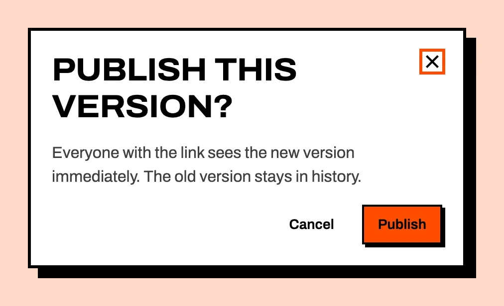
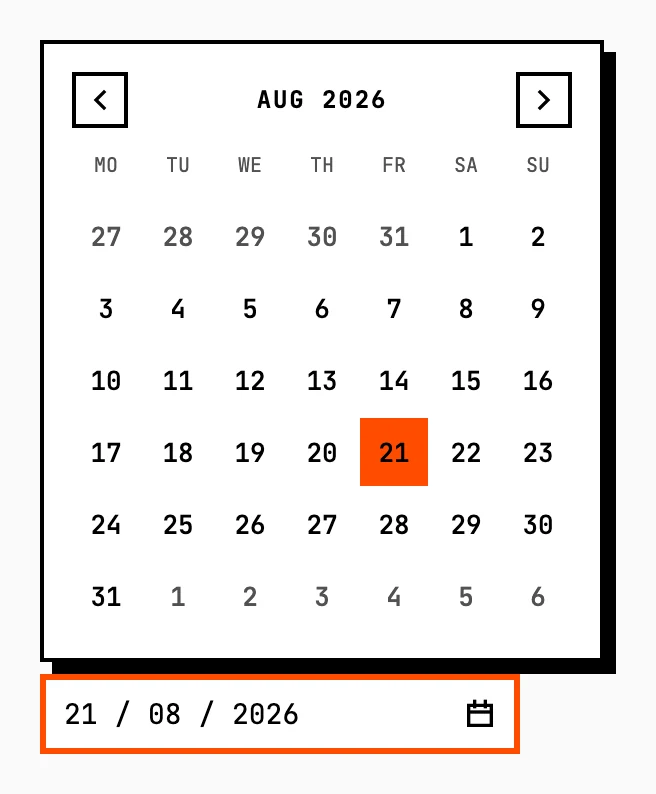
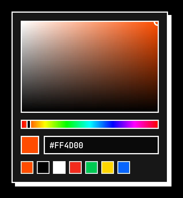
Every control is built on Ark UI, so behavior and accessibility come from a tested headless library and the styling comes from tokens. The date picker and color picker below are two of the most complex. The color picker also holds the one documented exception to the token rule.
Putting it together
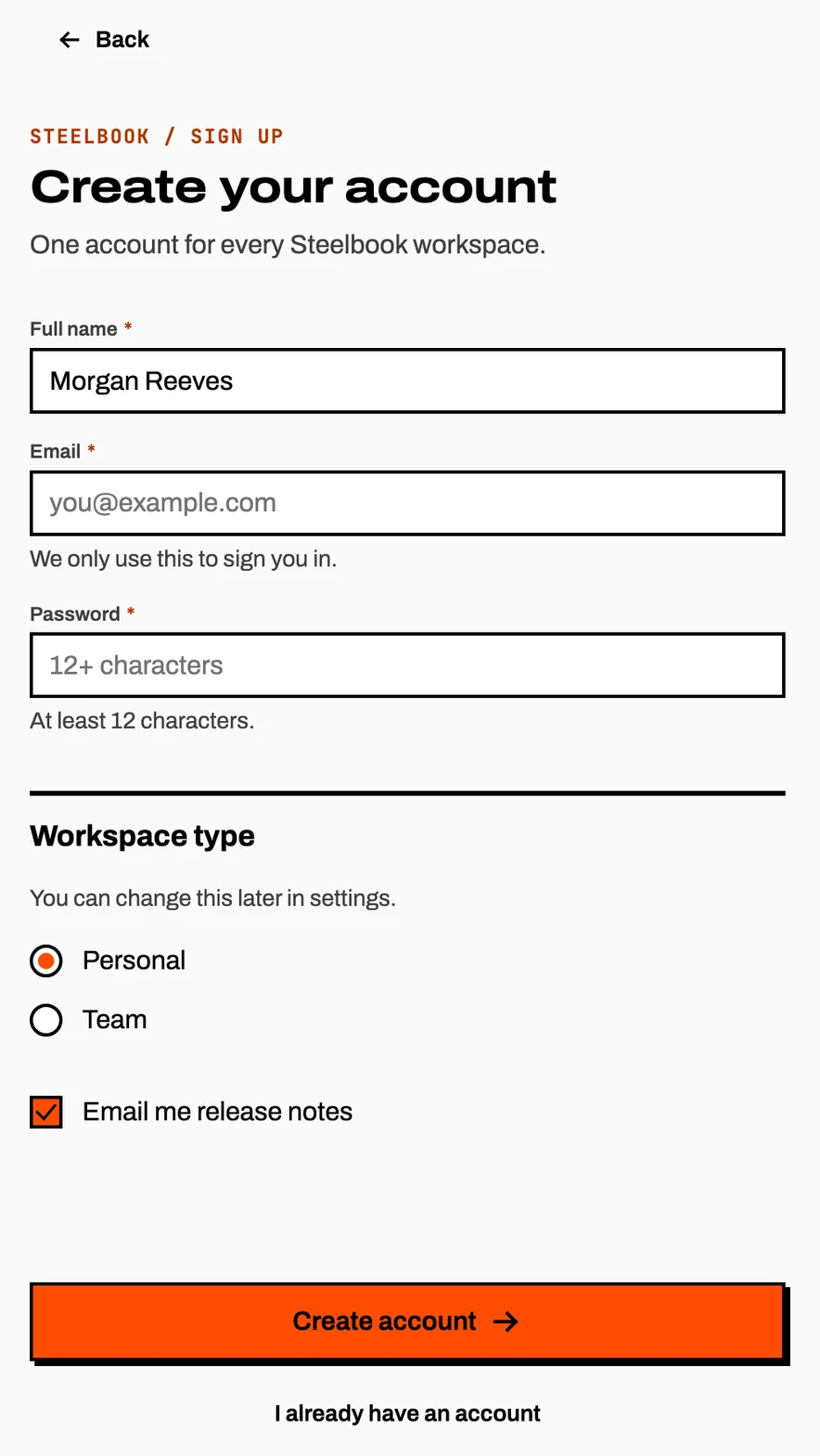
Nothing in the sign-up screen below was built for it. Field, Fieldset, RadioGroup, Checkbox and Button are composed with no new CSS, and every size and type style comes from a token.
Challenges
The agent kept to the rules the whole way. Every problem below passed typecheck, its type test, lint and my own review.
What the checks missed
9
Components drawing icons smaller than the file
14
Lint errors the first time the token check ran
2
Days the token check wasn't running
- Undersized
- Nine components set their icons at 14 or 12px when the file draws every icon at 16. They stayed small for the whole build, and I only caught it by eye on the last day. None of my checks could see a pixel.Clearedtypechecktestlintme
- Wired late
- The token check wasn't wired up until the last day, and it failed right away on Button, Switch and Toggle with 14 errors. For two days I was describing three checks while one of them had never run.Clearedtypechecktestlintme
- Written late
- One focus ring, one disabled style and one width behavior hold across all fifty components. I wrote them down after the fiftieth shipped. Until then they held because I was holding them.Clearedtypechecktestlintme
- Too rigid
- My first version of the focus ring rule was a size threshold. It was easy to check and wrong: the color picker's 22px swatch needs the outside ring. I reached for a number because a number is easier to enforce than a reason.Clearedtypechecktestlintme
- Seam
- Some gaps between Figma and code aren't anyone's fault: type can't be read from the API, the 768px breakpoint has no variable, and Code Connect isn't on this plan.
Impact
After 59 hours, one author and 102 commits:
50
Components
34
Icons
329
Design tokens
59
Hours
- Checked against the design: All 50 components have Storybook stories drawn at their Figma frame size and a type test that fails the build if their props drift
- One token layer: 329 tokens generated from four Figma collections, with no hand-edited values
- Dark mode: 56 color tokens across two modes, with no component changes
- Public: The repository, the Storybook and the Figma file are all open
Tracking
Auditing against Figma
A month after the build, I audited the whole repository against the Figma file: every component description, variable, text style, effect style and icon set. Every token value matched to the last digit. The audit found what the checks couldn't:
- A missing component: Collapsible was in the file with no code behind it. It's built now, with stories and a type test
- Missing icons: 6 of the 40 house icons had never been exported
- Icon sizes: Nine components still drew icons at 20 or 24px, and now take the 16px icon token
- A wrong default: Button defaulted to small when the file and its own description say medium
An MCP server for agents
The same week I added an MCP server to the repository, so any coding agent can build with Steelbook under the same rules. It has 13 read-only tools that list components and their props, look up tokens and icons, run the repository's own CSS lint, and review a piece of code for state props, raw values and hand-drawn SVGs.
Reflection
The biggest change was where my time went. The agent did the building. I spent my time writing component descriptions, deciding which rules a machine could check, and reviewing each change against what I had written. The reviews that took longest were the ones where my own description didn't answer the question.
What worked
- Rules the build enforces: Every rule that mattered was checked by something that could fail a build, so none of them depended on me remembering.
- Small pull requests: 53 pull requests, each small enough to actually read, kept review from becoming the bottleneck.
What I'd do differently
- Wire every check on day one: The token check ran for the first time on the last day and failed immediately. A check that isn't running protects nothing.
- Write the conventions down first: Focus ring, disabled style and width behavior belonged in the contract before the first component instead of after the fiftieth.
- Add a visual check: Types, tests and lint can't see a 4px difference in an icon. Screenshot comparison against the Figma frames would have caught it early.
Start the conversation
If you're hiring for design leadership, I'd like to hear what you're building.