(Re) Designing A Design System for LLMs
Prism is Kinective's design system. The first version was a Figma library built by hand. It had 815 variables, dark and high-contrast themes and kiosk typography, and using it correctly meant knowing how it had been built. Designers outside the core team drifted from it, and when the company started prototyping with AI, there was nothing an AI tool could read.
Prism 2.0 is the rebuild. Figma is the source for how things look, the code repository is the source for how things behave and what accessibility requires, and a build turns both into the packages and documents that designers, engineers and AI coding agents all use. Automated checks flag any mismatch between the two.

Key figures
100
Components with a machine-readable accessibility spec
Agent
Ready9
Drift checks between Figma and code, run on every build
Overview
Project overview
Prism is the design system under Kinective's 10 banking products. I founded it and I own it. Prism 1.0 did its job for the people who built it, and by mid-2026 two things made that untenable: product files were drifting from the library, and AI tools could not read it at all.
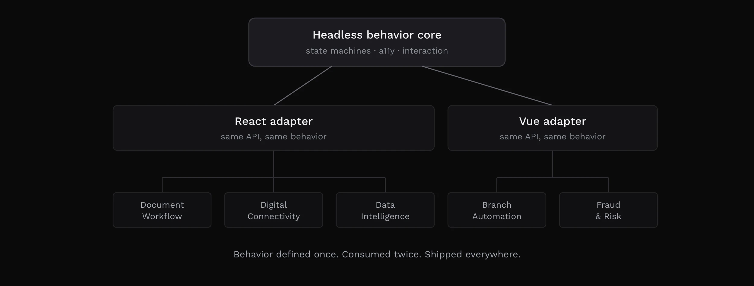
Prism 2.0 is a six-week rebuild. Figma defines how things look, the code repository defines how things behave and what accessibility requires, and a build turns both into the packages, docs and reference files that people and AI agents use. Automated checks confirm the two still match.
TL;DR
- Prism 1.0 was hard to adopt, and AI tools couldn't read it. AI-built prototypes made up their own UI, and designers had to rebuild them.
- We rebuilt Prism in six weeks. Figma is the single source, the code and docs are generated from it, and automated checks flag any mismatch.
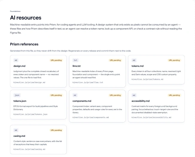
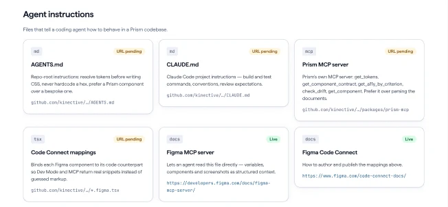
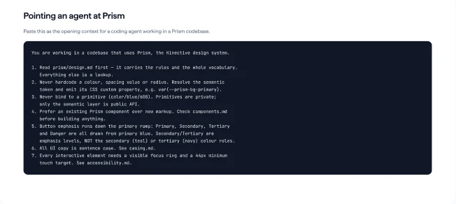
- AI agents read one file to learn every Prism name, look up details through an MCP server, and have their output checked automatically.
- Accessibility requirements are written for all 100 components, so they're built in from the start.
- Status: the foundation is complete, and components are built and continuing to be built in code. Two automated checks and one contrast issue are still open.
Measured in the files
1
File that teaches an agent all of Prism, in about 8,000 tokens
0
Semantic tokens holding a raw value, down from 106
100%
Components with a machine-readable accessibility spec, up from 0
4
Devices from one component set, on one attribute
On the same test file, the output checker now finds 22 problems in AI output where it used to find 4. Outside research on mature design systems projects front-end builds up to 47% faster and designers 34% faster; our own numbers come from the pilot.
Impact
Some improvements can already be measured in the files. Others are estimates from outside studies until the pilot gives us our own numbers, and each one is labelled.
Prism 1.0 and 2.0 compared
100%
Semantic tokens that alias a primitive, up from 77%
95%
Variables scoped to specific properties, up from 28%
100%
Components with a machine-readable accessibility spec, up from 0
Measured
- What an agent loads to know Prism: Nothing reliable, explained again in each prompt → one file, about 8,000 tokens, the full vocabulary
- Problems caught in AI output: 4 on a violation probe → 22. On a sample Prism prototype, 28 → 71
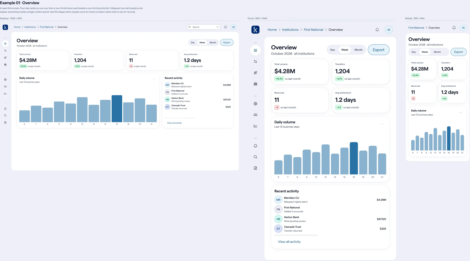
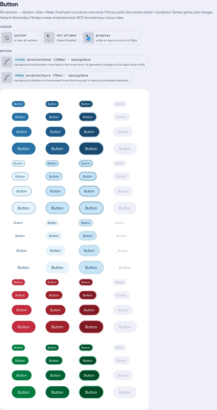
- Component sets needed per device: Per-theme and per-size copies on the page → one set, four modes by attribute
- Re-syncing Field after an Input change: Hand work, variant by variant → one scripted mirror pass, verified 20 of 20
- Semantic tokens that silently stop following the palette: 106 → 0
- First fully AI-built, Code Connected component: Avatar for Vue, built by the pilot team on September 25
The prototype workflow
A stakeholder AI prototype, before
- A leader prompts a working UI in an afternoon.
- It arrives looking finished; people have seen it work.
- Design works out what the invented UI was meant to do.
- Design rebuilds it on brand, accessible, and buildable in React and Vue.
- Engineering rebuilds it again from scratch.
The same prototype on Prism 2.0
- The agent loads
design.mdand the Prism MCP. - It builds from real components and role tokens.
- Automated checks catch problems before anyone reviews it.
- Design reviews the experience and the flow.
- Engineering builds on the same code.
Projected, from outside studies
Engineering
47%
faster to build a form with a mature design system than from scratch, including the time to learn it.
Source: Sparkbox, "The Value of Design Systems Study"
Design
34%
faster task completion for designers working with a relevant design system.
Source: Figma, "Measuring the value of design systems"
Consistency
10th
AI session matched the quality of the first once specs and fixed tokens were in place, in the Atlassian experiment Prism 2.0 was measured against.
Source: Hardik Pandya, "Expose your design system to LLMs", hvpandya.com
Our own numbers come from the pilot. Status on September 28, 2026: tokens, contract, gates, docs and MCP are complete, and components are built and continuing to be built in React and Vue with Code Connect. The next tranche unblocks Alert, Card, Checkbox Group, Drawer, Field and Popover. Two gates fail today and one contrast defect is open, all tracked.
Start the conversation
If you're hiring for design leadership, I'd like to hear what you're building.